“Mobile First” by Luke Wroblewski is a great introduction to designing web experiences that cater for both desktop and mobile devices. With a large number of people accessing the web on their mobile devices, “Mobile First” is all about designing user experiences beyond the confines of the desktop.
Naturally, there’s likely to be overlap between the design of native mobile applications and mobile first or responsive mobile design, where a desktop product is created with the mobile experience at the front of mind. In this book, Wroblewski focuses on creating basic websites which can be easily enhanced for mobile (i.e. smartphone and tablet) and PC. These are the main things I learned from reading “Mobile First”:
- Common constraints of Mobile First – The main constraints of designing for a mobile experience are (1) screen size, (2) performance and (3) time and place. The main point that Wroblewski makes with respect to all three constraints is that when designing for mobile one really needs to know his users and his business. It isn’t good enough to simply try and make your existing website work on a mobile phone; Wroblewski argues that “if you design for mobile first, you can create agreement up front on what matters most. You can then apply the same rationale to the desktop (and any other) experience of your web product.” A good example is Flickr’s mobile web experience which reduces 60+ navigation options on the Flickr website to 6 (see Fig. 1 below).
- Capabilities of Mobile First – Wroblewski outlines how you can use mobile device capabilities like camera, location detection and accelerometer to innovate (simple) use cases. Mobile opens up numerous new ways to meet people’s needs. However, one shouldn’t overlook browser limitations and the constraints these can impose on your mobile experience! It was also interesting to read about the 3 critical, common mobile interaction types as identified by Josh Clark (author of “Tapworthy”, see Fig. 2) which are reflected in Google’s breakdown of mobile users (see Fig. 3).
- Content over navigation – Whereas the more ‘traditional’ websites can be quite navigation heavy, one of the key principles of Mobile First is “content over navigation.” Wroblewski’s main advice is to start the conversation with users through content rather than navigation. YouTube and ESPN’s mobile web experiences are good examples. In both cases, the navigation options have been reduced and simplified (see the example of ESPN in Fig. 4).
- Touch and “Going small by going big” – Having touch devices means using your fingers to interact with a site or application! Wroblewski therefore stresses the importance of creating appropriately sized and placed actions (‘touch targets’) to help people tap with confidence and accuracy. As an example, the book mentions Quora’s mobile web login screen as an example of where the key actions are quite small and placed closely together (see Fig. 5) which bears the risk of carrying out the wrong action.
- Designing for different mobile devices – I was pleased to see that Wroblewski addresses the design and implementation issues around constantly changing mobile devices, browsers and operating systems. I guess the key point here is that with responsive web design you can set a baseline mobile experience first and adapt your layout as device capabilities change. This tends to be referred to as “fluid layouts” whereby interface elements like search are designed in such a way that they adapt to the space available to them. A good example is the fluid layout used for Google Places which adapts to different screen widths available.
Main learning point: “Mobile First” is an easy to read book on responsive web design. Fortunately, the book doesn’t spend too much talking about the pros and cons of native vs responsive mobile design. Instead, Wroblewski explains the main principles and benefits behind a mobile first design approach, without closing his eyes for some of the potential pitfalls and risks involved. Even though “Mobile First” sometimes gets a bit too technical for my liking, the book does a great job in getting designers and non designers to think more about designing with mobile in mind.
Fig. 1 – Flickr’s mobile web experience
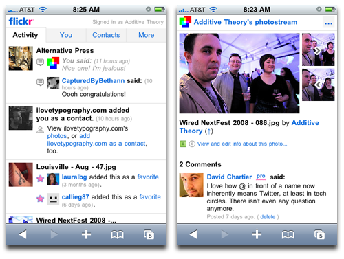
Fig. 2 – Three critical, common mobile interaction types (from: “Tapworthy” by Josh Clark)
1. Micro-tasking
2. “I’m local”
3. “I’m bored”
Fig. 3 – Google’s breakdown of mobile users (as adapted from Timo Elliott’s great blog post)
1. Repetitive now – The user who checks the same piece of information over and over again (e.g. the weather forecast)
2. Urgent now – A request to find something specific fast (e.g. directions to the airport now)
3. Bored now – Users who have time on their hands (e.g. on their commute)
Fig. 4 – ESPN’s mobile web experience, a good example of “content over navigation”

Fig. 5 – Quora’s mobile web login screen where the main actions are quite small and are placed closely together

Related links for further learning:
- http://designshack.net/articles/css/mobilefirst/
- http://mashable.com/2013/06/02/mobile-design-tips/
- http://en.wikipedia.org/wiki/Responsive_web_design
- http://timoelliott.com/blog/2007/04/googles_three_bi_behavior_grou.html
- http://dmolsen.com/2012/05/23/the-cautionary-tale-of-the-expert-has-spoken-jakob-nielsen-the-mobile-site-debate/
- http://www.forbes.com/sites/anthonykosner/2012/01/30/mobile-first-how-espn-delivers-to-the-best-available-screen/
- http://www.creativebloq.com/web-design/responsive-ecommerce-websites-12121456
 As I learn ...
One response to “Book Review: “Mobile First””
[…] a need to create a truly mobile culture and mindset within the business. To help companies become mobile first, Moatti introduces the “Mobile Formula” which contains the three rules for successful […]