I guess we all know how frustrating it can be to have to sit in meetings that just feel like a waste of time or that could have been dealt with in 30 minutes (instead of 3 hours). I know that there are quite a few apps out there which help us to run more productive meetings, but I decided to focus on Do:
- How did this app come to my attention? – I got an alert from Product Hunt about Tools for Product Managers, promising me a list of “the tools the pros use”. Do was only ranked 10th on this list, but I guess it was this comment from one of the Product Hunt voters, that intrigued me the most: “I was a Yammer PM. Do.com is the meetings platform I wished I had.” Especially given that it came from a guy who used to be at Yammer – who are all about collaboration within the enterprise – this comment made me want to find out more about the product.
- My quick summary of the app (before using it) – Do helps you to have more productive meetings; I therefore expected a tool which helps its users to make their meetings as efficient as possible. The tool doesn’t yet seem to be available on iOS or Android, only on PC.
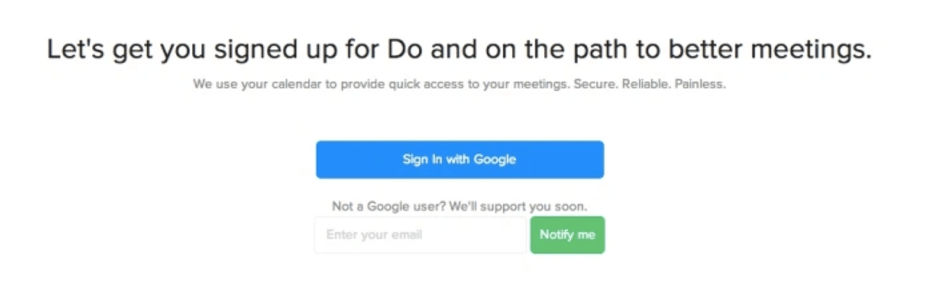
- Getting started, what’s the sign-up process like? – I have to sign up to use Do. At present, Do only seems to support Google users; all non Google users will be notified as soon as they will be able to sign up (see Fig. 1 below). Once I’ve selected my Google account, I get presented with a permissions screen (see Fig. 2 below). I click “Accept” and my personal dashboard appears. All fairly straightforward.
- How does the app explain itself in the first minute? – The default page of my dashboard shows a simple timeline with meetings on the relevant dates and times (see an example in Fig. 3 below). To be honest, I felt a bit underwhelmed at first , thinking “is this it!?”. However, the subsequent overlay which consisted of six ‘how to’ screens was quite useful, explaining in a simple but effective way how to best get started on Do (see Fig. 4 below).
- How easy to use was the app? – Using the tool felt very intuitive and easy. The layout of the dashboard is clear and easy to understand. Adding a new meeting to the dashboard felt no different to doing the same thing in Google or Outlook (see Fig. 5 below).
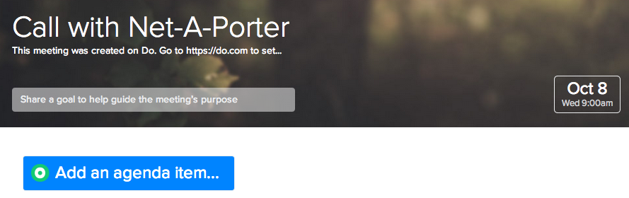
- How did I feel while exploring the app? – Like I mentioned above, exploring Do felt incredibly easy and intuitive. The signposting used in the tool is self-explanatory and the navigation options have been kept to a minimum. A quick click-through on an individual agenda item highlighted a key purpose of Do; the ability to create and share a meeting outline, making it easy to collaborate around meeting goals and agenda items (see Fig. 6 below).
- Did the app deliver on my expectations? – Yes, it did. I felt a bit underwhelmed at first, expecting Do to provide more, ‘less obvious’ features. However, whilst playing with the application, I discovered features like “Invite” and “Takeaways”, which I believe are missing from most standard diary / meeting applications.
- How long did I spend using the app? – A few days to start with, but I expect to be using it a lot more in the future!
- How does this app compare to similar apps? – I had a quick look at MeetingHero which serves a similar customer proposition to Do. At a first glance, MeetingHero seems a bit less advanced and intuitive in comparison to Do. MeetingHero is, however, available as an app on iOS which means that the app can be used on the go.
Main learning point: Do is a straightforward and easy to use meeting app. I like its interface and its key features; the app makes collaborating around meetings very easy. It will be interesting to see how Do will perform in already crowded marketplace, with apps and systems that enable similar things. I’m now curious to see what the mobile version of the application will look like!
Fig. 1 – Screenshot of Do’s sign-up screen
Fig. 2 – Screenshot of Do’s permission screen
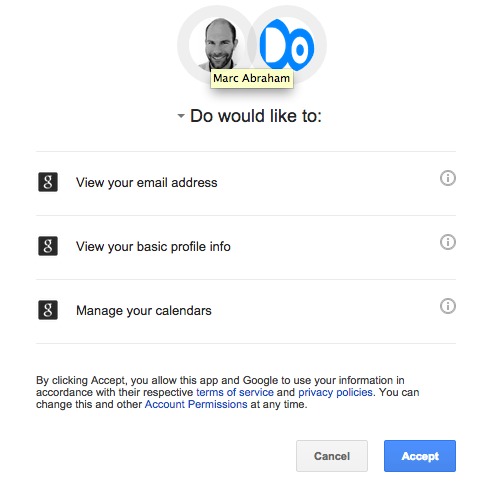
Fig. 3 – Screenshot of sample meeting in my meeting calendar in Do
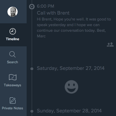
Fig. 4 – Screenshot of one of the introductory ‘How to’ screens on Do
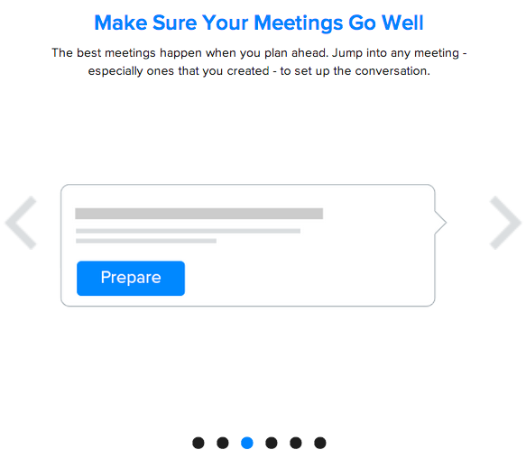
Fig. 5 – Screenshot of functionality in Do to create a meeting

Fig. 6 – The ability to share a meeting goal and agenda items