
I always like discovering new apps, playing with them and seeing what works for me and what doesn’t. I recently looked at some apps in the property finder’ space. Julie Zhuo has recently written up a good way to do a “product critique” which template I’ll apply to my app reviews. I recently used the iOS app from Zoopla, a UK based property site, and applied Julie’s product critique template:
- How did this app come to my attention? – I looked at the Zoopla site a few years ago, but hadn’t interacted with the site (or the app) since. I’d heard about significant improvements to both the user interface and functionality of the app, reason why I was keen to have a play with the app.
- My quick summary of the app (before using it) – Zoopla’s app enables users to find properties to buy or rent in their local areas.
- Getting started, what’s the sign-up process like? – Registering as a new Zoopla user was pretty straightforward; only an email address and a password were required for me to register. I noticed that I didn’t need to be logged in to do actions such as messaging the estate agent about a property that I was interested in. This clearly makes it easier for me to quickly enquire about a property.
- How does app explain itself in the first minute? – On the app’s opening screen, it clearly says “Zoopla” followed by the “Smarter property search” strap line. Most of he options on the opening menu – ranging from “For sale” to “MyZoopla” – are pretty self-explanatory (see Fig. 1 below). I felt that some of the navigation options could have benefited from some additional explanation. For example, “Current values” and “MyZoopla” could have done with explanatory hover over comment to explain their function and value to users.
- How easy to use was the app? – I found it very easy to use the app. When I played with the app, I particularly concentrated on an important use case: finding a property to buy (see Fig. 2 below). The app lets users filter their searches by a number of factors such as price and number of bedrooms (see Fig. 3 below). When you get the results, the app enables both hiding and sorting of the results. Hiding can be particularly helpful if one doesn’t want the same search results to come up time and time again. By default, the search results are sorted by ‘Most recent’ but users can sort by e.g. ‘lowest price’ or by ‘most popular’.
- How did I feel while exploring the app? – Zoopla’s app is easy to explore; the navigational items are clearly signposted and the split menu bar meant that I could easily find my way around in the app.
- Did the app deliver on my expectations? – Yes, the app was simple and easy to use. It delivered on the main use cases that I expected the app to cover: finding properties, either to buy or to rent. However, the one bit of functionality and information that I missed from the app was the ability for users to sell their properties or put them up for rent through the app. It made me wonder whether this could be because Zoopla’s business model is based around estate agents who submit properties to be listed in the app.
- How long did I spend using the app? – I’d say I spent about 15 minutes in total playing with the app.
- How does this app compare to similar apps? – Lovely Rentals in the US and Rightmove in the UK are apps similar to Zoopla. I personally find the user interface of the Rightmove app a lot less appealing in comparison; it gives me the feeling that I have to work hard to get the property results that I’m looking for. A good example is the “Sale Filters” screen in the Rightmove app (see Fig. 4 below). At a first glance, I struggle to comprehend what the “advanced” option will do for me or what “Include Sold STC” means. In contrast, I immediately sensed that the Zoopla was easy-to-use and intuitive.
Main learning point: Zoopla’s property app is easy to use and intuitive. It’s a no-frills app which does exactly what you expect it to do. I like the way the app gives it users the ability to easily filter and sort search results. All around, a good and easy to use app!
Fig. 1 – Screenshot of the opening screen of the Zoopla app

Fig. 2 – Screenshot of property listings on the Zoopla app

Fig. 3 – Screenshot of search options when looking to buy property through the Zoopla app
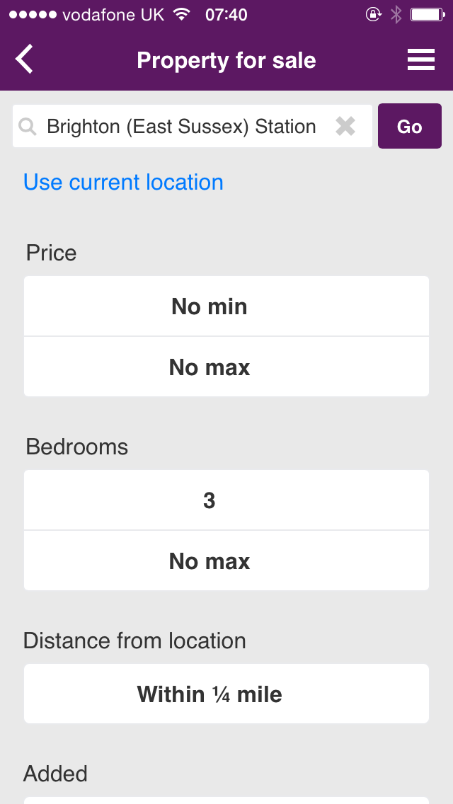
Fig. 4 – Screenshot of the “Sale Filters” screen in the Rightmove app

