
I work for a marketplace – Not On The High Street – and I’m therefore always on the lookout for new marketplaces. I recently came across Tabl who promise “the world’s best dinner parties” and it prompted me to have a closer look at what Tabl are all about:
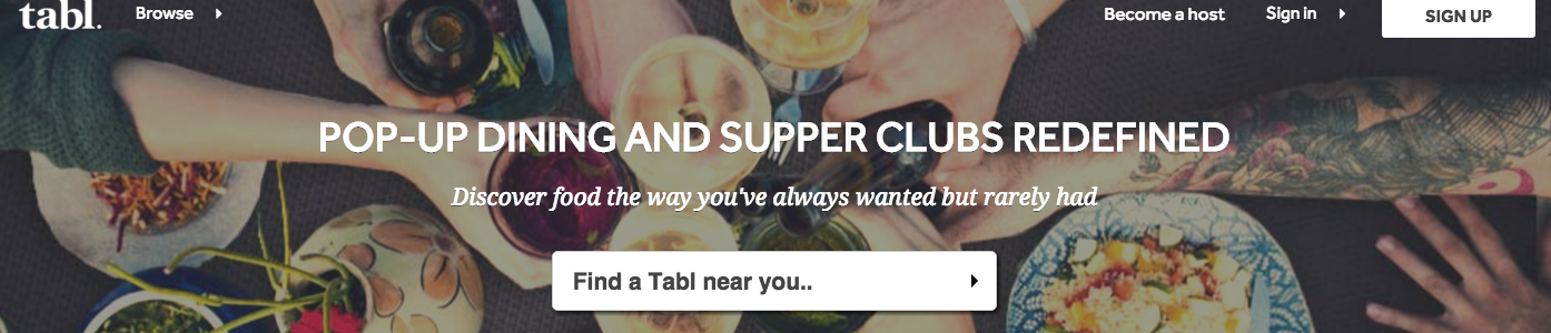
My quick summary of Tabl (before starting to use its service) – I expect a service similar to Open Table, Resy and Uncover, which enables me to book a table at a cool restaurant.
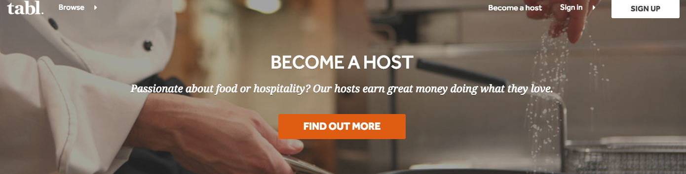
How does Tabl explain itself in the first minute? – A very first look at the site tells me that Tabl connects people looking for new dinning spaces with people who offer a dinning space. If I click on the “Be our guest” tab, then I see just above the fold that there are food related events I can choose from. Similarly, if I click on “Become a host”, the content on the page is actually the same as on the “Be our guest” page, but the headline banner has changed to encourage hosts to come forward. I can imagine that Tabl’s business model is that of marketplace, with its success determined by both the number of people interested in dinning at unique spaces (similar to Dinner Lab in the US) and people who have space or an experience to offer (thinking of Appear Here in the UK).
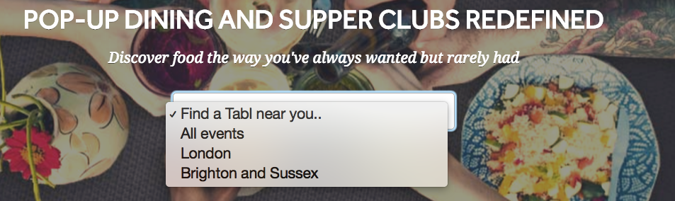
Getting started, what’s the process like (1) – The aspect I’m most interested in is ‘finding a Tabl near me’. So I click on the arrow next to the “Find a Tabl near you …” on the homepage. I clicked on the arrow, both in a signed in state and in a non signed in state. In a signed in state, I’d expect to be presented with one option, e.g. London or north London, based on my post code details as part of my Tabl account. Given that I live in London, seeing options in Brighton and Sussex are not really of interest to me.
When I arrive on the page showing events in London, it becomes instantly clear to me that there are no dining events this week. A decent amount of real estate has been devoted to alerting the user that there are no events this calendar week, however, given that I’m checking on the last day of the week, this message doesn’t come as a total surprise to me. Also, I’m thrown slightly by the call to action to “add an event”, given that I’m looking for an event and have no intention to host one …

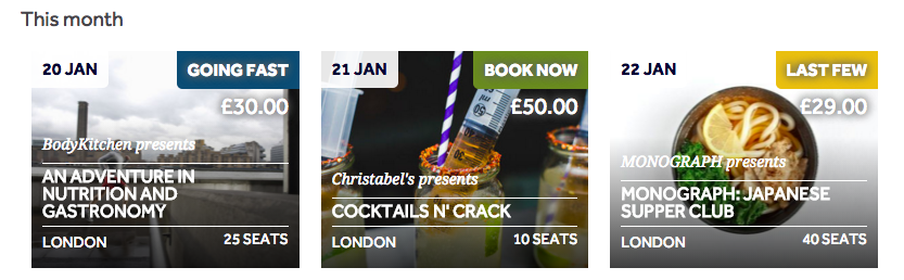
When I then scroll down the page, I see that there are events in the coming week for me to look at. When I scroll down even further and look at events “this month” these seem to be repeated.

Personally, I would downplay the fact that there are no events this week, especially since the user hasn’t specifically indicated that she’s looking for events this week. This prominent message would be more appropriate if the user were to search for events within a specific time frame. Instead, I would automatically display those events on dates closest to day on which I’m carrying out my search.
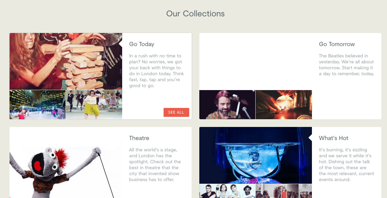
Alternatively, Table could highlight a section of curated or recommended events, similar to the what YPlan do with their ‘collections’ section.
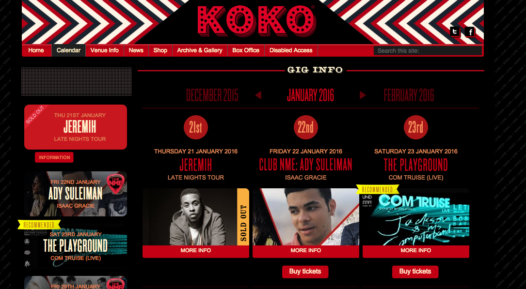
Also, the need to scroll down the page to find out about upcoming events feels somewhat clunky and would need revisiting for a mobile solution, irrespective of whether this would be a native or responsive solution. Instead, I’d consider using a format where the user can navigate easily between months or weeks, like on the KOKO site.
For first time users I’d include a call to action to find out more about their dining or event preferences. For example, you might be a vegetarian and therefore not interested in pop up ‘steak parties’ or might be looking for events for no more than 25 people to keep things intimate. This means that Tabl can provide its (recurring) users with more tailored and personalised recommendations.
Getting started, what’s the process like (2) – I select Monograph: Japanese Supper Club which will be be held on 29 January ’16. I really feel this event page can work a lot harder than it’s doing currently. Firstly, the imagery on the page feels suboptimal. The resolution of the header image feels poor and I think that one can pick a more enticing image for a secretive Japanese supper club dinner. The pictures of the different menu options could be given greater prominence, based on my assumption that users are more likely to book a table after seeing appealing food pictures as opposed to reams of text about how great the food is. But then again I’m not a food critic!
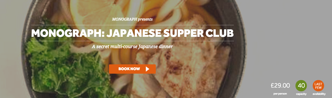
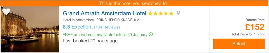
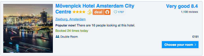
Also, the ‘hooks’ used to get users to book now for this event could be much stronger. For example, the ‘last few’ icon feels a bit lost within the image at the moment. Instead, I’d create a call to action around ‘only 4 places left!’, instilling a sense of urgency within the user and pressing them to book now if they don’t want to miss out. A simple example can be found on Travel Republic where it indicates that a room was booked in my hotel of interest 20 hours ago or booking.com which highlights the number of people look at and booking a specific hotel.
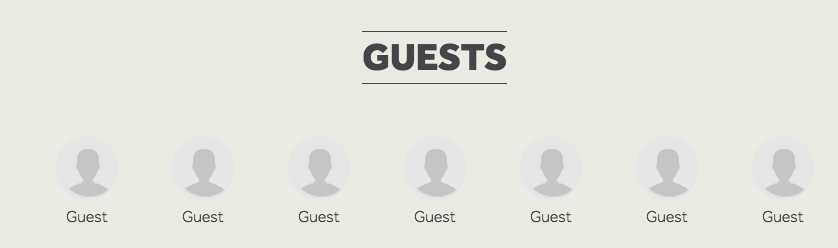
Instead of highlighting other guests at the bottom of the page, I’d suggest removing this feature and instead creating a ‘similar events’ section. This would keep those users on board who decide not to book a table at the Japanese Supper Club but might want to discover other, similar, events instead.
How does Tabl compare to similar services? – I looked at Dinner Lab, a US based service that offers a service very similar to Tabl. The design and experience of Dinner Lab feels clean. However, the discovery element, encouraging users to explore more events and stay on the site feels very limited. For example, when I look at Burns Night on 22 January ’16 I can see it’s sold out, but there’s no sign of any other or similar events to consider (see below).

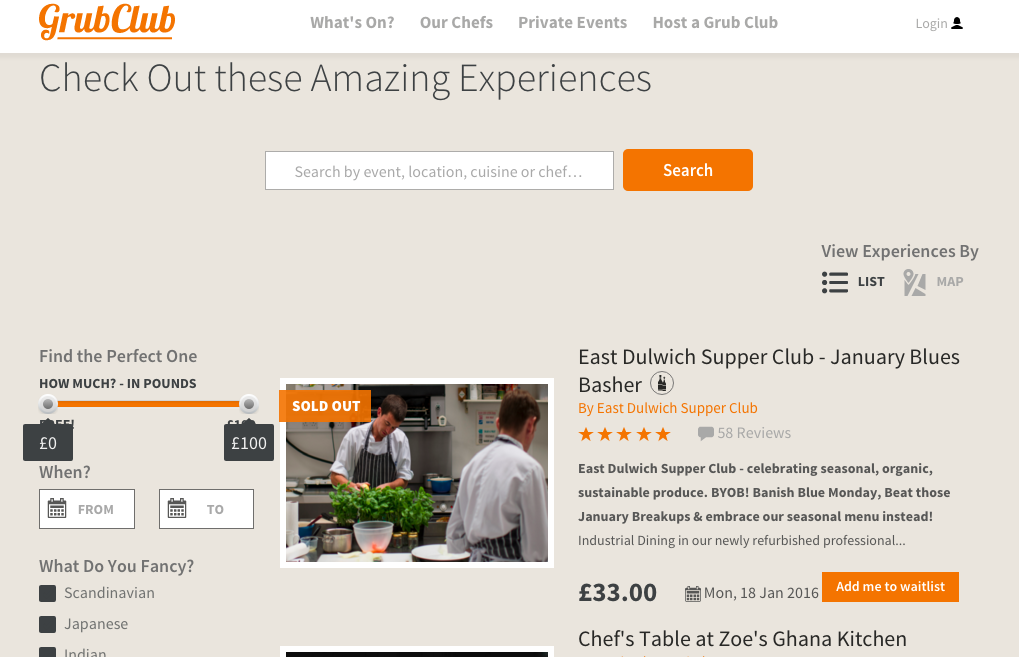
GrubClub also feels very similar to Tabl. It strikes me how users can filter events on Grub Club in order to be presented with dinning options that feel most relevant to them. For instance, if I’m looking to meet new people, there’s a tag for that. In addition, Grub Club has a ‘Curated by us” section which Tabl doesn’t have.

Did the app deliver on my expectations – My main feedback after using Tabl and some of its competitors is that I would suggest that they take a critical look at the content (and its signposting) and navigation. Currently, there are a significant number of pages on the site with content that could ‘work harder’ to convert users and space owners. Even more so, there seem to be quite a few pages with no content whatsoever, which doesn’t make for a great user experience. Tabl’s proposition is great, and there’s ample opportunity for Tabl to find ways to prove its value more effectively.

One response to “Tabl (Product Review)”
[…] looked at a range of marketplaces, most recently in the events space, I widened my search and came across YunoJuno. YunoJuno is an online marketplace which […]