In my last post I wrote about the use of heuristics to find usability problems in designs. In this post, I’ll look into the individual heuristic principles in more detail. It was UX expert Jakob Nielsen who introduced these “10 Heuristics for User Interface Design” in 1985 and these principles serve as a great context to evaluate user interface (‘UI’) designs against:
- Visibility of system status – “The system should always keep users informed about what is going on, through appropriate feedback within reasonable time.” As a user, one always wants to know what’s happening; “what’s the status of my current action?” or “what’s happening next?” A good example is the file upload process on Basecamp where the upload button is enabled until clicked. It’s then replaced with a progress bar until the upload has completed (see Fig. 1 below).
- Match between system and the real world – “The system should speak the users’ language, with words, phrases and concepts familiar to the user, rather than system-oriented terms. Follow real-world conventions, making information appear in a natural and logical order.” A good example is Apple’s iTunes library navigation where the terms used – music, movies, podcasts, etc. – are self-explanatory and unambiguous (see Fig. 2 below).
- User control and freedom – “Users often choose system functions by mistake and will need a clearly marked “emergency exit” to leave the unwanted state without having to go through an extended dialogue. Support undo and redo.” An older example of how not to do this comes from “Amazon’s ‘Review and Sell Your Product’” form (see Fig. 3 below). The form doesn’t contain any (obvious) way for the user to cancel or revisit his listing, as observed really well by Lisa Duddington in her great blog post.
- Consistency and standards – “Users should not have to wonder whether different words, situations, or actions mean the same thing. Follow platform conventions.” In your UI design you ideally want to create as little opportunity for user confusion as possible and consistency is therefore paramount. A good example is Microsoft Office where Word, Excel, and PowerPoint all use the same style toolbar with the same primary menu options: Home, Insert, Page Layout, etc. (see Fig. 4 below).
- Error prevention – “Even better than good error messages is a careful design which prevents a problem from occurring in the first place. Either eliminate error-prone conditions or check for them and present users with a confirmation option before they commit to the action.” A good case in point is the “share” functionality in Yammer where the disable button is disabled after it has been clicked in order to prevent the user from updating the same post twice (see Fig. 5 below).
- Recognition rather than recall – “Minimise the user’s memory load by making objects, actions, and options visible. The user should not have to remember information from one part of the dialogue to another. Instructions for use of the system should be visible or easily retrievable whenever appropriate.” This heuristic is all about making information visual and directly available to the user. Try to avoid creating extra hurdles for the user and help user recognition with previews (e.g. offering previews of all available templates – see Fig. 6 below).
- Flexibility and efficiency of use – “Accelerators – unseen by the novice user – may often speed up the interaction for the expert user such that the system can cater to both inexperienced and experienced users. Allow users to tailor frequent actions.” Examples of this principle are flexible shortcuts in the Firefox browser or having flexible defaults with options. A good example of the latter is Expedia who provide some set categories as part of its online hotel search functionality whilst still allowing users to enter a free text field.
- Aesthetic and minimalist design – “Dialogues should not contain information which is irrelevant or rarely needed. Every extra unit of information in a dialogue competes with the relevant units of information and diminishes their relative visibility.” An obvious but great example in this respect is Google’s main search page, which is clear, functional and has loads of white space (see Fig. 7 below).
- Help users recognise, diagnose, and recover from errors – “Error messages should be expressed in plain language (no codes), precisely indicate the problem, and constructively suggest a solution.” This principle is all about making the problem (and the related solution) clear to the user, by for example highlighting the specific fields that the user forgot to fill out. It clearly helps if an application can show a path forward to the user. A good example is this page taken from a money management tool which explains in clear terms to the user which fields still need completing. I’ve included a similar error alert in Fig. 8 below and which proposes a way for the user to solve the problem.
- Help and documentation – “Even though it is better if the system can be used without documentation, it may be necessary to provide help and documentation. Any such information should be easy to search, focused on the user’s task, list concrete steps to be carried out, and not be too large.” Examples of a good application of this heuristic are to help learning and decision making through the use of examples within the UI.
Main learning point: I found it incredibly helpful to delve a bit deeper into some of Jakob Nielsen’s “10 Usability Heuristics for User Interface Design” as it helped me to understand the kinds of factors which can influence ‘good design’. These principles can act as a great starting point when reviewing designs and user interfaces.
Fig. 1 – Screenshot of Basecamp’s upload process (taken from: http://designingwebinterfaces.com/6-tips-for-a-great-flex-ux-part-5)

Fig. 2 – Screenshot of iTunes’ library navigation (taken from: http://designingwebinterfaces.com/6-tips-for-a-great-flex-ux-part-5)

Fig. 3 – Screenshot of previous Amazon’s ‘Review and Sell Product’ form (taken from: http://usabilitygal.com/2010/04/30/amazon-fails-on-heuristic-%E2%80%98user-control-and-freedom%E2%80%99/)

Fig. 4 – Screenshot of Microsoft Office toolbars (taken from: http://designingwebinterfaces.com/6-tips-for-a-great-flex-ux-part-5)

Fig. 5 – Screenshot of Yammer’s update feature (taken from: http://designingwebinterfaces.com/6-tips-for-a-great-flex-ux-part-5)
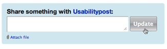
Fig. 6 – Screenshot of the font options available in Keynote (taken from: http://designingwebinterfaces.com/6-tips-for-a-great-flex-ux-part-5)

Fig. 7 – Screenshot of Google’s main search page
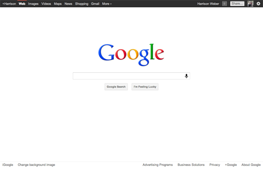
Fig. 8 – Screenshot of a message alerting the user that his USB device has not been recognised

 As I learn ...